Patients First — A Case Study

Photo by rawpixel.com from Pexels
Design Challenge
The design challenge was to take a look at some aspect of healthcare and see if there was an opportunity to improve things.
Problem Space
I decided to look at the problem of finding a new family doctor in the city of Toronto.
When people move to Toronto, one of the things they need to do is find a family doctor. From my own experience, finding one that is good and convenient can be incredibly challenging. Without a family doctor, many of the routine check-ups that a person’s health relies on go undone. Although we do have a system of walk-in clinics that people can visit, most of them are too busy to perform yearly physicals or other routine check-ups. After doing some secondary research, I decided to answer the following question.
How might we provide new residents of Toronto with the information they need to quickly find a family doctor?
Constraints
This design challenge was carried out over the span of about a week and the deliverable was a lo-fi prototype with hi-fi content.
User Experience
Assumptions
- It is very time consuming to find a new doctor
- There are not enough family doctors taking on new patients
- It is not always possible to find a doctor that is trustworthy and is conveniently located
User Interview Themes
After doing several user interviews and secondary research, these were the themes that stood out.
- People want a doctor that is close at hand and doesn’t require a lot of travel time
- It is very hard to find any kind of reviews or ratings on doctors. This is a concern for new immigrants to Canada that come from places where reviews serve as a primary means of finding a new doctor.
- There are no resources listing doctors accepting new patients so it comes down to luck e.g., contacting clinic at the right time
- For people coming from other countries (India), there is lots of confusion around the referral system in Ontario. They are used to booking appointments directly with specialist instead of needing a referral from their family doctor.
Key Research Insights
There is a lack of resources about what doctors are good and which ones are accepting new patients. The result is that finding a new family doctor really comes down to luck; phoning the right clinic at the right time.
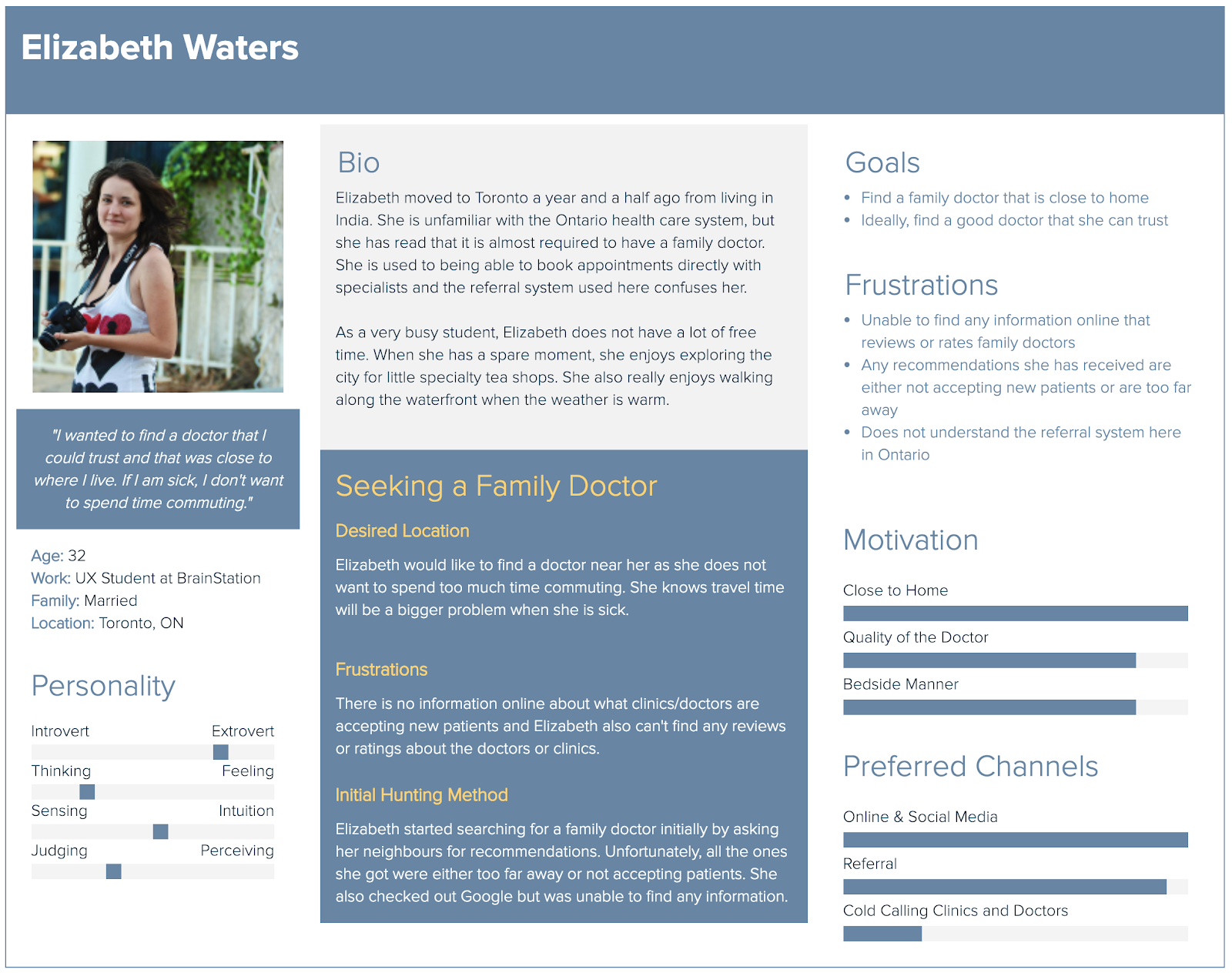
User Persona
Based on the people I interviewed, I put together the following persona. The persona serves to remind the team that what is being created is for a real person.
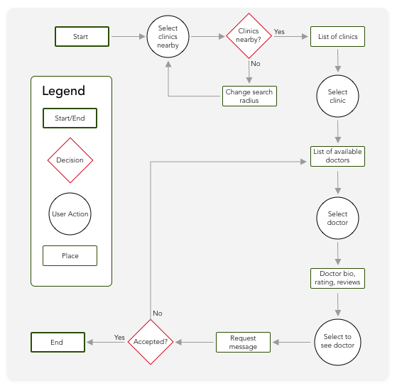
Task Flow Diagram
Once I had a better understanding of the problem, I created a task flow diagram to understand how people will interact with the prototype. It charts the steps a person will go through to find a new doctor.
User Interface Design
Once I understood the problem and the direction the project was taking, it was time to start on the UI.
Initial Sketches
To begin, pen and paper sketches were drawn and tested using POP (Prototyping on paper) by Marvel.

Wireframes
The initial sketches tested well as far as flow and navigation went, so the next step was to create the initial wireframes.
User Testing
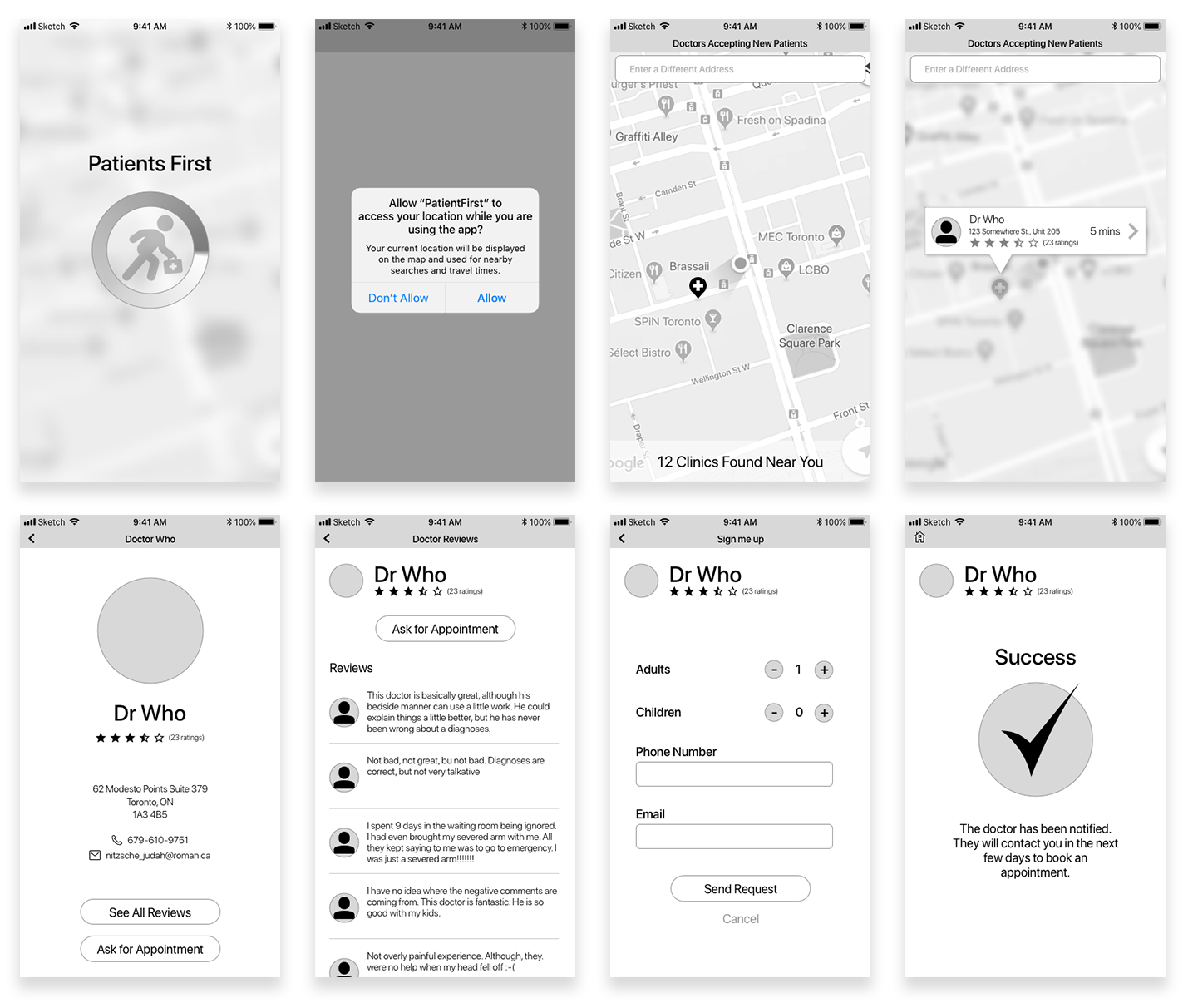
Once the wireframes were created, the prototype went through several rounds of user testing. Once again, the general flow tested welll; however, there were some changes that need to be made.
- The back and home button were too small
- People were not sure what to do on the final, success screen
- Distances being in minutes was confusing with testers saying they would prefer Kilometers
- There was a general confusion about what "Ask for Appointment" meant. People expected to book a date and time instead of sending a message
Wireframes Version 2
Below are the changes made after the first round of user testing was completed.
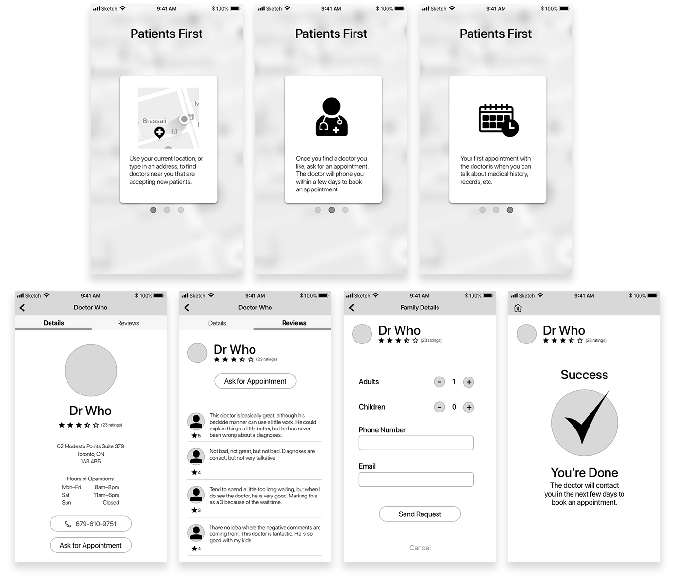
Changes
In response to user testing, the following changes where made.
- To help explain the point of the prototype and what to expect, an onboarding process was added.
- The doctor page was changed to a tabbed layout to make it more obvious that there are two sections and make it easier to find the reviews.
- I added "You're Done" to the text on the final screen to help people realize that their task was complete.
User Testing, Round 2
There were only two small changes that came out of this round of testing.
- Ability to specify whether the doctor should call or send an email in response to asking for an appointment. This is more a feature request than a usability problem.
- Pressing the back button on the reviews page should take the user back to the details page. Currently, it takes the user back to the map page. However, only one user was surprised by this behaviour.
Key Findings
The most interesting thing I learnt from this project was that people have certain expectations of what a mobile app should do. During user testing, once people made it to the final screen they were expecting more from the prototype. Everyone was surprised at how little the prototype did even though it was explained in the onboarding screens. The biggest thing that people expected was for the app to schedule an appointment and take care of transferring health records instead of just sending out an email.
“I strive for two things in design: simplicity and clarity. Great design is born of those two things.”—Lindon Leader